The importance of having a solid, attractive logo cannot be overstated as it serves to identify your company and separate it from the competition.
However, creating a logo that truly stands out while standing the test of time is quite the challenge.
The creation of logos is an ever-changing industry where what may have worked yesterday may seem old fashioned and out-of-date by today.
However, the good news is that you can avoid short-lived trends and ideas that may leave your logo in the dust by focusing on proven and exciting methods which make your logo unique and timely. What follows are a few tips and trends that will help you create a logo that works today, tomorrow, and into the foreseeable future.
Understanding Your Audience
Arguably the trickiest part of making a new logo is creating something that consumers can identify with in terms of your industry but does not go too far or look out of place. Can you imagine a law firm using bright, garish colours in their logo? Probably not. So, before you set out to create your logo design, the first step should be researching your target audience and including their expectations in your final design. Your graphic designer can help with this.
This means knowing the demographic, gender, and general taste of your audience that can be used as a baseline for creating a logo. This is not so much a trend, but a general practice that should be incorporated if you want a design that works.
Stack the Letters
If your company name consists of a few words rather than a single word, then you should consider stacking the words instead of going with a straight line. It’s a trend that has been growing over the past few years, but it makes good sense because it helps to highlight your company name and incorporate different designs and colours to really make a bold statement.
Plus, stacking creates an original look that is simple to achieve. This type of simplicity will stand the test of time, so you can get the attention of consumers without going overboard on graphics or use garish colours.
Using Negative Space
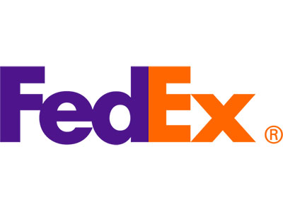
Perhaps the most well-known example of a company logo using negative space is Federal Express. Their “Fed Ex” logo cleverly uses an arrow, which is formed by the combination of the “Ex”, to demonstrate movement, a perfect complement to the purpose of their business which is delivery.

You can use negative space by creating a symbol inside the lettering or design that makes the logo more interesting. Simple uses of negative space can really make your logo stand out, especially if it combines different meanings.
Overlapping Designs
The overlap of lines, designs, and colours creates a sense of depth which results in having a logo that looks new, fresh, and bold. Plus, the illusion of three dimensions makes it stand out from whatever format it appears, from business cards to billboards to computer screens. You can take your old logo and use the overlapping technique to breathe new life into it without having to undergo a major redesign.
Many high-profile companies use overlaps in their logos, but the good news is that because the use is so broad, you will not be seen as copying a trend, but instead improving your logo design within your industry.
Include Meaning
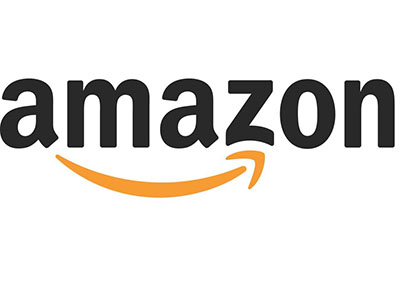
Putting in a hidden message or meaning to your logo adds interest to the design. Such as the arrow on the Amazon logo that goes from “A to Z”, meaning that they have everything you need. By including a message or meaning to your logo, you not only add interest, but importance which can have a positive effect on consumers.

Keep in mind that your logo is really the front porch of your business. As an essential part of your marketing strategy, incorporating a meaning or message can add value while not adding any addition words.
Keep It Simple
If there is a timeless trend in logo design, it is simplicity. This means using as few lines and characters as possible to get across your message. Today, keeping things simple is more important than ever since your logo will be viewed on a variety of platforms both small and large. So, you can create a sharp, edgy logo that uses few lines while still getting across your business name.
The same is true for the shape of the logo. By using basic shapes such as circles, points, and lines, you can retain the simplicity of the logo while making it stand out. The trick is to minimalise the use of shapes so that you only use what is absolutely necessary. A circle encompassing your business name along with a creative font for the first letter of your company offers real impact without clutter.
In the end, you can use one or more of these proven trends to create an interesting logo that helps separate your company from the competition. It will take some research and experimentation, but the end result is a logo that helps your business move forward and reach more consumers.
Contact us today if you need a new logo design.