
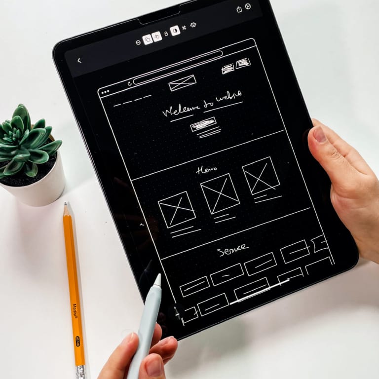
Get a new online presence with our responsive web design.
Your website on all screens.
We’re responsive web design experts. Your site looks and works great on all devices. Our team creates flexible, user friendly designs that adapt to any screen size. User experience and engagement boost.
Our responsive design gives you a multi device experience. Increase accessibility, user engagement and SEO with a design that fits all screens.
Responsive design is no longer a nice to have; it’s a must have. Here’s why:
- Better User Experience
- More Mobile Traffic
- SEO
- Less Maintenance
- More Conversions
Is your site ready for all users, on all devices? Contact us today and let us revolutionise your website with our responsive web design services.s.


Why do you need a responsive website?
With more and more mobile devices being released each year, each with different screen sizes and resolutions, having a responsive website is the best way to future proof your online presence. A mobile friendly website ensures that no matter how your mobile users or desktop visitors access your site, they experience a seamless and optimised design.
A mobile website is no longer just an added feature, it is a necessity. Research shows that around 50% of internet users now browse primarily on mobile phones, meaning if your website is not mobile friendly, you could be losing half of your audience. Having a mobile friendly website ensures that your content is accessible, easy to navigate, and engaging for both desktop website users and those on multiple devices.
Looking for web design in Reading? See our main web design services.
Responsive websites adapt to their environment.
A well designed responsive website automatically adjusts to different screen sizes and orientations, providing an optimal viewing experience for all users. Whether your visitors are browsing on a mobile screen, tablet, or desktop, your website layout will seamlessly adapt to deliver the best possible experience.
- Responsive websites adjust to fit any mobile screen, ensuring a smooth browsing experience
- A mobile friendly website makes navigation easier for mobile users and improves overall usability
- A mobile site ensures that users on mobile devices can easily interact with your content
- Websites that are not optimised for mobile phones may lose potential customers due to poor readability and navigation
- A mobile website improves site speed, making pages load faster for users on smartphones and tablets
A Website built for the future.
In a digital landscape where users constantly switch between multiple devices, having a responsive website is the key to success. Whether your audience is browsing on a desktop website, smartphone, or tablet, your web page should automatically update and restructure itself in real time to fit the screen. This means no zooming, no excessive scrolling, and no frustration, just a seamless experience designed for any mobile screen.
We understand how important it is to keep up with changing technology. That is why we build mobile friendly websites that adapt to today’s devices while remaining flexible for the future. Whether you need a brand new mobile website or an upgrade to an existing desktop website, we are here to help.
Let us create a responsive website that not only looks great but also delivers the speed, functionality, and seamless experience your visitors expect.


Benefits of a mobile friendly website.
Responsive website design has many benefits for website owners and users. Firstly, responsive websites give a consistent and optimised user experience across devices, user engagement and satisfaction. Users can switch between devices without sacrificing usability or content.
Also, responsive website design drives mobile traffic as search engines rank mobile friendly websites higher. And mobile friendly design means no need to maintain separate mobile and desktop versions, saving time and resources.
Why mobile friendly design is essential.
With more people browsing the web on mobile devices than ever before, having a mobile friendly website is no longer an option, it is a necessity. A mobile website ensures that your content adapts to different screen resolutions, providing an optimal viewing experience whether users are on mobile phones, tablets, or desktops. Mobile friendly sites are designed to look great and function smoothly on smaller screens, making them accessible to a wider audience.
A well structured mobile friendly design not only improves usability but also boosts rankings on search engines, as Google prioritises sites that deliver a seamless user experience across all devices. If your site is difficult to navigate or slow to load on a mobile screen, you risk losing visitors before they even engage with your content.
The importance of a mobile optimised website.
A truly mobile optimised website does more than just shrink down a desktop version, it is designed with mobile users in mind from the ground up. This means adjusting screen width, font sizes, navigation menus, and interactive elements to provide an intuitive browsing experience on mobile devices.
A key factor in creating an effective mobile website is ensuring fast website speed. Slow loading pages frustrate visitors and lead to higher bounce rates, particularly on mobile phones, where users expect instant access to information. Optimising your mobile website improves your website’s loading time, making it easier for visitors to navigate and encourage users to stay longer.
A responsive website for every screen.
A mobile responsive site automatically adjusts its web page layout depending on the screen resolution and screen width of the device being used. This eliminates the need for separate desktop versions and mobile friendly sites, ensuring a consistent experience for all visitors.
By focusing on mobile friendly design, businesses can create a seamless user experience that keeps visitors engaged, reduces bounce rates, and drives conversions. Whether your customers are on mobile devices or desktops, your website should be easy to navigate, fast to load, and visually appealing on any screen.
Ready to upgrade to a mobile friendly website? Let us help you build a mobile website that meets the needs of today’s mobile users while preparing your business for the future.
Responsive website design history.
Responsive design was first coined by web designer and developer Ethan Marcotte in a 2010 article on A List Apart. Marcotte saw the changing landscape of mobile devices and browsers and proposed a design that would adapt to the user not the other way around. Since then mobile friendly design has been the norm in web design especially with the rise of mobile and all the different screen sizes.
Why a mobile friendly website?
Mobile Usage
As of 2021 54.8% of all web traffic comes from mobile devices, up from 31.16% in 2015 (Statista). This is a steady increase and shows how important it is to have a website that works across all mobile devices.
User Expectations
A Google study found 61% of users will leave a site if it’s not mobile friendly and 67% are more likely to buy or use a service if the site is mobile friendly.
SEO Ranking
Google rolled out mobile first indexing in 2019 so Google is now using the mobile version of the content for indexing and ranking. Non mobile websites can negatively impact the site’s ranking in search engine results pages (SERPs).
Bounce Rate
According to a Think With Google study, websites that load in 5 seconds on mobile devices have a 70% longer average session length, 35% lower bounce rate and 25% higher ad viewability compared to sites that take 19 seconds to load.
Online Shopping
eMarketer estimates by 2021 mobile devices will account for 73% of total ecommerce sales. So businesses without mobile websites could be missing out on a huge chunk of the ecommerce market.
Local Search
Google reports 88% of consumers who search for something locally on their smartphone visit or buy within a day. In other words responsive local SEO could be the key to driving foot traffic to physical stores.
These stats show why mobile friendly design is no longer an option but a must have for any website.


Mobile friendly design trends.
As technology moves forward responsive design must keep up with new mobile devices and form factors. Responsive images using new technologies allow for automatic image selection based on the user’s device and viewport. Adaptive typography using variable fonts gives you control over letterforms for better legibility on all screen sizes.
By considering design elements, going mobile first, testing and continuous optimisation mobile friendly design lets your website stay ahead of the digital curve. Go responsive and delight your users across the digital landscape.
Get a mobile responsive website today!
Don’t let your website fall behind in a world where most users browse on smaller screens. A fully mobile responsive website ensures your visitors enjoy a seamless experience, whether they’re using a smartphone, tablet, or desktop.
If your mobile site is difficult to navigate or slow to load, you could be losing potential customers. We design mobile responsive sites that adapt effortlessly to any device, improving usability and engagement. Whether you need a brand new mobile site or want to upgrade your existing website, we are here to help.
Get in touch today and let’s build a mobile responsive website that looks great and works flawlessly on smaller screens.