When should you redesign your website? Learn the signs to watch for and how to decide between a simple refresh and a rebuild.
Have you ever visited a website on your phone and found yourself having to zoom in just to read the text? Or tried pressing a button, only to accidentally tap something else because everything was squeezed together?
It’s annoying, isn’t it? And when it happens, there’s a good chance you’ll give up and find another website that works properly.
The thing is, your potential customers are doing exactly the same.
People use their phones for practically everything now, whether that’s finding a local plumber, ordering something online or looking up a business they’ve just heard about. They might discover your website through Google, click a link on social media or visit after someone recommends your company.
If your website is difficult to use on a mobile phone, you could be losing those visitors before they’ve even had a chance to see what you offer.
That’s why we think having a mobile friendly website is something every business should take seriously. Not because it’s the latest trend in web design, but because people expect websites to work properly on whatever device they happen to be using.
A Website That Looks Good on a Computer Might Be Terrible on a Phone
One thing that’s easy to forget when looking at a new website design is how differently people experience it depending on their device.
On a desktop computer, you’ve usually got a large screen, a mouse and plenty of room to display photographs, text and navigation menus. Everything can be nicely spaced out, with different page elements sitting alongside each other.
Now try squeezing that same layout onto a mobile screen.
Suddenly, the text becomes difficult to read, images take up too much space and buttons that were easy to click with a mouse become awkward to tap with your thumb.
You might have a perfectly attractive desktop website, but that doesn’t mean the mobile version is going to be pleasant to use.
This is where responsive design comes in. Rather than creating a completely separate mobile site, responsive web design allows the layout to adjust depending on the screen size.
For example, a website might display three columns of information on desktop computers but arrange them vertically when someone visits on a phone. Images can resize, text can remain readable and navigation menus can change to make better use of the available space.
It’s not about removing everything that makes your website interesting. It’s about presenting the same information in a way that works on different devices.
And with so many different mobile screen sizes available, from smaller smartphones to larger tablets, this flexibility is important.
People Have Very Little Patience With Awkward Websites
Think about how you actually use your phone when you’re looking for something.
Perhaps you’re sitting on the sofa watching television, checking a website while waiting for someone or trying to find a local business while you’re out.
You’re probably not giving that website your full attention.
If the page takes ages to load, the menu doesn’t open or you have to keep zooming in to read things, you’re unlikely to spend much time trying to make it work.
You might give it another few seconds, but eventually you’ll probably press the back button and try somewhere else.
This is why mobile friendly design matters beyond simply making a website look nice.
A good mobile experience should make things easy. Visitors should be able to read your content, find the information they need and contact your business without having to think too much about how the website works.
If someone wants your phone number, they shouldn’t have to search through five different pages to find it. If they’re trying to complete an enquiry form, the fields should be easy to use without constantly zooming in and out.
Small annoyances add up, especially on a small screen.
And while one awkward button might not seem like a big problem, it could be enough to put someone off contacting your business.
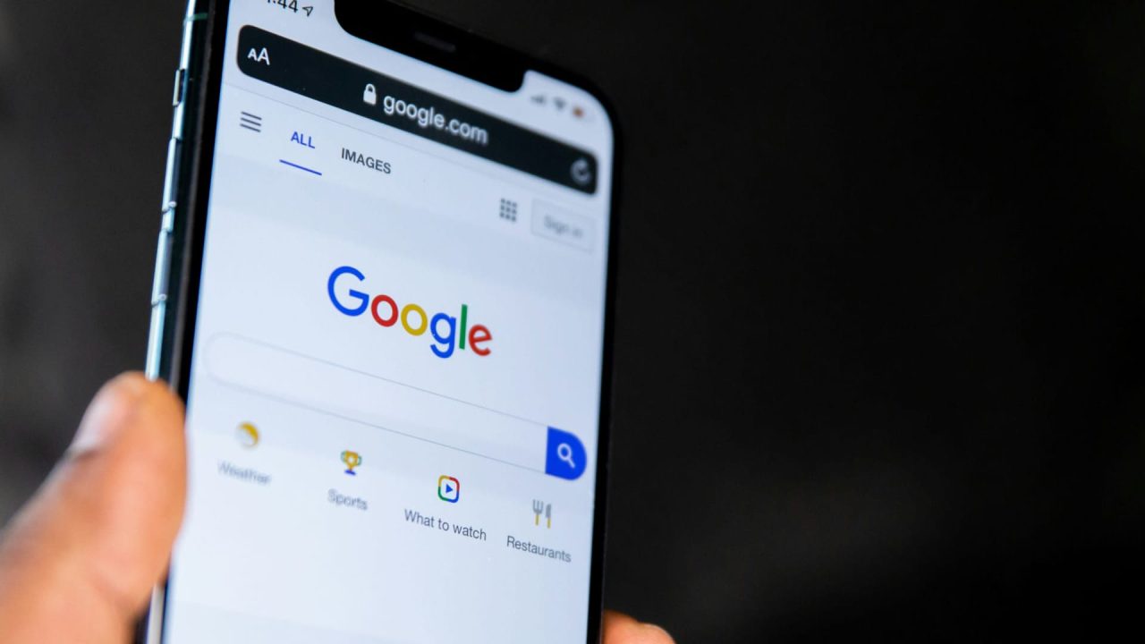
Mobile Design Is About More Than Shrinking Everything Down
There’s a fairly common misunderstanding that making a mobile friendly website simply involves taking the desktop site and making everything smaller.
Unfortunately, that approach often creates more problems than it solves.
Good mobile website design requires some thought about how people actually interact with their phones. A mouse pointer is quite precise, but fingers are not. Something that’s easy to click on a computer might be surprisingly difficult to tap on a smaller screen.
That’s why we pay attention to details like font size, spacing and the position of clickable elements.
Buttons need to be large enough that people can easily tap them without accidentally pressing something nearby. Text needs to be comfortable to read, and page elements should have enough breathing room that the whole layout doesn’t feel cramped.
Navigation is another area where mobile design often needs a different approach.
On a desktop website, you might have a full navigation menu running across the top of the page. That isn’t always practical on a phone, so many websites use what’s called a hamburger menu instead.
You’ve probably seen the hamburger icon before. It’s the little symbol with three horizontal lines that opens the main navigation when you tap it.
There’s nothing particularly clever about it, but it saves space and can help keep the design tidy. The important thing is making sure the menu actually works and that visitors can find the pages they’re looking for.
We also think it’s worth being careful with pop ups. They might look acceptable on a large desktop screen, but on a phone they can cover almost the entire page. There’s nothing quite as irritating as trying to read something while a large form blocks the content and the close button is practically impossible to press.
A bit of common sense goes a long way with mobile friendly design.
Website Speed Matters More Than You Might Think
A slow website is frustrating on any device, but it can be particularly noticeable on a mobile phone.
Not everyone is sitting at home with a strong internet connection. Someone might be using mobile data, travelling through an area with poor reception or trying to load your website on an older phone.
If your pages are full of unnecessarily large images, complicated effects and files that take too long to download, those visitors could be waiting longer than they should.
And the longer they wait, the more likely they are to give up.
Website performance is something we consider when building websites because there isn’t much point having an attractive design if visitors struggle to load it.
Images are a good example. A photograph might look fantastic, but if the file is far larger than necessary, it can slow the page down without providing any real benefit.
The same applies to CSS files, scripts and other resources that the browser needs to display your website. Keeping things organised and avoiding unnecessary features can make a noticeable difference to load time.
If you’re curious about your own website’s speed, Google offers a free tool called PageSpeed Insights. You can enter your website’s URL and run a speed test to see how the page performs on mobile and desktop devices.
The test results can highlight potential issues, including slow loading elements and opportunities to improve performance.
It’s worth remembering that a speed test isn’t a perfect representation of every visitor’s experience. Results can vary depending on the device, connection and conditions under which the test is run.
But it can be a useful starting point if you suspect your website is slower than it should be.
Google Looks at the Mobile Version of Your Website
There’s another reason mobile friendliness deserves attention, and that’s how Google handles websites in its search results.
Google uses a system called mobile first indexing. Essentially, this means Google primarily uses the mobile version of a website’s content when indexing pages and assessing their relevance for search.
This is quite an important change from the way people used to think about web design, when the desktop website was often treated as the main version and mobile was something to worry about afterwards.
If important information is missing from your mobile website, Google may not be able to use that content in the same way it would if it were available on both versions.
For example, imagine your desktop site has a detailed page explaining your services, but the mobile version removes half that information because someone thought the page looked too long on a phone.
That might make the mobile page shorter, but it could also mean removing useful information for both visitors and search engines.
This is one reason we prefer responsive design. The website can use the same URL and largely the same content across multiple devices, while adjusting how everything is displayed.
Google recommends this approach because it’s generally easier to implement and maintain than having separate mobile and desktop websites.
Of course, mobile friendly design alone won’t guarantee better search rankings. Google considers many things when deciding which pages should appear in its search engine results, including how relevant and useful the content is.
But making your website difficult to use on mobile devices certainly isn’t doing your visitors any favours, and it can create avoidable problems for search visibility.
You Don’t Need a Separate Mobile Website
Years ago, it wasn’t unusual for businesses to have one website for desktop users and another for people visiting on their phones.
You might have seen mobile websites using a different address, sometimes beginning with an “m” before the main domain.
That approach still exists, but it’s rarely necessary for the sorts of business websites we build.
With responsive design, the same website can adapt to various devices without needing two separate versions.
This means someone visiting from a laptop, tablet or smartphone can access the same pages using the same URL. The layout changes to suit the available screen space, but you aren’t having to manage two completely different websites.
It makes updates easier too.
If you change the wording on a service page, you don’t want to worry about editing the desktop version and then remembering to make the same change on a separate mobile website.
Responsive design helps avoid that unnecessary duplication.
It also means you don’t need mobile apps just to give customers a decent experience on their phones. For most small businesses, a properly designed mobile website provides the basic features customers need, without requiring them to download anything.
Naturally, some businesses have more complicated requirements, and there are situations where dedicated applications make sense. But for a local electrician, accountant, builder or similar service business, a responsive website is usually a much more practical solution.
Have You Actually Tried Using Your Own Website on Your Phone?
This might sound like a strange question, but it’s worth asking.
Business owners often spend a lot of time looking at their websites on desktop computers, particularly when reviewing designs or making changes. It’s easy to forget that customers might be seeing something quite different.
One of the simplest things you can do is pick up your phone and use your website as though you’ve never visited it before.
Try finding your services. See how easy it is to get to the contact page. Open the menu, scroll through the content and attempt to complete an enquiry form.
Can you comfortably read the text without zooming in? Are the buttons easy to press? Do the images fit properly, or does something disappear off the side of the screen?
Try it on another phone if you can, especially one with a different screen size or operating system. Something that looks perfectly fine on one device might behave differently on another.
It’s also worth asking someone else to have a look. When you’re familiar with your own website, you already know where everything is, which can make it difficult to notice problems that might frustrate a new visitor.
There are online tools that can help test websites at different screen sizes, but actually using the site on a real phone is still a valuable part of checking the mobile experience.
You might be surprised by what you notice.
A Better Mobile Experience Can Mean More Enquiries
For most small businesses, the real reason to improve a website isn’t to win design awards or impress other web designers. It’s to make the website more useful to potential customers.
Imagine someone finds your business through Google while looking for a local service. They open your website, read about what you offer and decide they’d like to get in touch.
If your phone number is easy to find, they can tap it and call you. If they’d rather send an enquiry, they can open a form, type a short message and submit it without any difficulty.
That’s how it should work.
Now imagine the same person visiting a website where the text is tiny, the contact button is difficult to press and the enquiry form doesn’t fit properly on the mobile screen.
Even if the business provides an excellent service, the website is making it harder for someone to become a customer.
Good mobile friendly design removes those unnecessary obstacles.
It can help keep users engaged, make your business appear more professional and give visitors a better user experience. And when people find your website useful, they’re more likely to explore your services or make an enquiry.
The benefits aren’t limited to Google either. Someone might discover your company through social media links, a recommendation or another website. Wherever the visitor comes from, the experience should be just as straightforward.
A website that works properly across different devices also makes it easier to reach a wider audience. Not everyone uses the latest smartphone, and not everyone prefers browsing on a desktop computer.
Your website needs to work for the people who actually visit it, rather than expecting them to use a particular device.
Mobile Friendly Doesn’t Mean Complicated
One of the things we like about good web design is that the best decisions often aren’t particularly complicated.
You don’t need elaborate animations, dozens of interactive features or a completely different experience for every mobile screen size.
Sometimes it’s as simple as using a readable font size, choosing large buttons, making sure images resize properly and keeping the navigation easy to understand.
A clean design that loads quickly and helps visitors find what they’re looking for will often be more useful than something packed with features nobody really needs.
That doesn’t mean every website should look the same. A creative business might want a very different design from a local tradesperson, and there should still be room for personality.
The important thing is making sure the design doesn’t get in the way of the website’s functionality.
Mobile technology will continue to change, and people will keep using different devices to browse the web. A responsive website gives you a sensible foundation for dealing with those differences without constantly having to start again.
For us, mobile friendliness isn’t an optional extra that gets added once the desktop website is finished. It’s something that should be considered from the beginning of the project.
Is Your Website Easy to Use on Mobile?
If you haven’t looked at your website on your phone recently, it’s worth spending a few minutes checking how it works.
You don’t need to understand web design to notice when something feels awkward. If you find yourself struggling to read the content, navigate between pages or contact your own business, there’s a reasonable chance some of your visitors are having the same problems.
At Website Designer Reading, we build professional WordPress websites for businesses in Reading and the surrounding areas, with responsive design considered throughout the development process.
We want the websites we create to look good, of course, but we also want them to be practical. That means making sure visitors can comfortably browse your services, find important information and get in touch, whether they’re using a phone, tablet or computer.
If your current website is looking a little dated or doesn’t work particularly well on mobile, we’d be happy to discuss what could be improved.
Get in touch and tell us about your website. We can have a chat about what you need and how to make it easier for your customers to use.